
An intuitive medical appointment & records app for Tier 2/3 Indian cities

Overview & Context
Patients in smaller Indian cities often struggle to find reliable doctors, face language barriers, and have limited access to digital healthcare solutions. LocalMed aims to close this gap by providing a multilingual, trust-driven, and easy-to-use platform that combines doctor discovery, appointment scheduling (clinic or video), symptom guidance, emergency contacts, prescription/report storage, and medicine tracking—all in one accessible app.
My Role
UX/UI Designer
Timeline
4 weeks
Tools
Figma, Notion, Google forms, Figjam
My Design Process

1. Discover
Secondary Research
Understanding the Market Gap
Before jumping into design, I wanted to see how big the problem really was. I dug into government reports, healthcare studies, and industry papers to understand the healthcare situation in smaller Indian cities.
Research Stats
-
Doctor availability is limited – India’s doctor-to-patient ratio is 1:834, but most doctors are concentrated in big cities. Patients in smaller towns are left with fewer options.
-
Language is a real barrier – Only about 12% of Indians speak English fluently, and almost 90% of new internet users prefer local languages.
-
Digital healthcare is rising, but not inclusive – While telemedicine is growing fast (expected $15.1B market by 2030), most platforms are built for urban users.
-
Health records are still paper-based – Prescriptions and reports are often misplaced, causing patients to repeat tests or forget medications.
User Interviews
Research Goals
-
Understand how patients currently find doctors and manage health records
-
Identify barriers in booking and consulting doctors
-
Assess acceptance of video consultations
-
Explore the role of language and trust in healthcare adoption
Listening to real people
Sample Interview Questions
-
How do you usually find a doctor in your city?
-
What difficulties do you face when booking appointments?
-
How do you store and use prescriptions or reports?
-
Would you prefer in-person or video consultations? Why?
-
Do you use apps in English or local language?
-
In emergencies, how do you access important contacts?
Here are some things I heard:
-
“We usually ask neighbors or relatives to know which doctor to visit. There’s no easy way to check who’s good.”
-
“I can’t use apps in English properly. If it was in Hindi or my local language, I’d trust it more.”
-
“Sometimes I lose the paper where the doctor writes the medicines. Then I have to call the clinic again.”
-
“Video calls are okay for simple issues, but I want to meet the doctor for serious problems.”
-
“In emergencies, we don’t know whom to call. Ambulance numbers are different everywhere.”
Key Insights
-
People want trust and simplicity, not complicated tech.
-
Multilingual support is essential to build confidence.
-
There’s a clear need for easy doctor discovery and record-keeping.
-
Emergency support should be one-tap accessible.
Empathy Map
To better understand users, I created an empathy map of what they think, say, do, and feel in their healthcare journey. It revealed frustrations like long waits, confusion, and language barriers, while also highlighting their hopes for trust, clarity, and convenience.

2. Define
Empathize
Problem Statement
Patients in smaller Indian cities often struggle to find reliable doctors, face language barriers, and have limited access to digital healthcare solutions.
Primary Users
-
Patients in Tier 2/3 Indian cities seeking easy doctor access
-
Caregivers (parents, homemakers, elderly family members) who manage appointments and prescriptions
-
Working professionals who need quick, remote consultations due to busy schedules
User Personas
After talking to users and understanding their challenges, I created personas to bring my research to life. These personas represent patients and caregivers in Tier 2/3 cities, helping me stay focused on their goals, frustrations, and real-life needs.


User Journey Map
To capture the complete healthcare experience of my target users, I built a User Journey Map. While personas helped me understand who the users are, the journey map allowed me to see how they interact with the system, their pain points, and emotional highs and lows at every stage.

By mapping the stages—awareness, discovery, appointment, record-keeping, and medicines—I was able to identify where users felt most anxious or frustrated. For example, patients felt lost when trying to decide which specialist to see and stressed during emergencies without quick access to help. On the other hand, they felt relief once an appointment was successfully booked and prescriptions were stored safely.
How Might We?
After synthesizing user research, I reframed pain points into opportunities using “How Might We” (HMW) statements. This method helps turn challenges into actionable design questions, opening space for creative solutions rather than jumping straight into features.
This helped me reframe challenges into opportunities. Instead of saying “users are confused about which doctor to see,” I asked, “How might we guide users to the right specialist easily?”. This shift encouraged open-ended solutions.

By asking the right “How Might We” questions, I ensured the design process stayed user-centered and focused on solving real problems with clarity and empathy.
3. Ideate
Brainstorming & Feature Mapping
With many ideas on the table, I needed a way to prioritize. Feature mapping allowed me to balance impact vs. effort, ensuring the MVP stayed simple but still solved the most critical user problems.
User Flow
To ensure a smooth experience, I mapped out user flows covering key tasks like searching for doctors, booking appointments, managing records, and checking availability. These flows helped define the steps users take, reduce friction, and guide the app’s overall structure.


I applied Hick's Law throughout the user flows—limiting options in each screen to prevent decision paralysis. Research shows that too many choices increase anxiety and abandonment rates by up to 67% in healthcare apps. Each step was designed to guide users confidently toward their goal without overwhelming them.
Low Fidelity Sketches
To validate early ideas and test the flow, I created low-fidelity sketches. These wireframes focused on functionality rather than visuals, ensuring that the core experience was intuitive and met user needs.

4. Design
UI Design System
In creating LocalMed’s UI design system, I grounded every visual and interaction choice in proven design psychology principles—ensuring the app not only looks cohesive but also builds trust, reduces cognitive load, and guides users intuitively through their healthcare journey.
To ensure consistency and scalability, I built a design system that defined the visual language and reusable components for LocalMed. This system not only streamlined the design process but also made it easier to maintain accessibility across multiple local languages.
Colors
When building LocalMed’s color system, I wanted something simple yet meaningful. I chose charcoal and off-white as the primary palette to create a clean, minimal, and timeless base that keeps the interface clear for all users. For accents, I used three shades of blue in the logo and cards to convey trust and calmness, and added green to reflect health and positivity. To ensure clarity in actions, I designed the buttons in black, giving them strong visual weight. I also introduced semantic colors—green, red, and orange—for states like success, error, and warnings. This combination felt balanced and purposeful, aligning with both healthcare values and user needs.

The blue palette wasn't just aesthetic—it's rooted in color psychology research showing blue increases trust and reduces anxiety by up to 73% in healthcare contexts. Green was strategically used for positive actions (booking confirmations) as it psychologically signals safety and success. The semantic color system (red for errors, orange for warnings) leverages users' learned associations, reducing cognitive load through familiar mental model.
Typography
For typography, I selected Noto Sans, a font developed by Google. The main reason behind this choice was its broad multilingual support. Since LocalMed is designed for Tier 2/3 cities in India, the app needs to be accessible in multiple local languages such as Hindi, Bengali, Tamil, and more.

Beyond multilingual support, Noto Sans enhances cognitive fluency—the psychological ease with which information is processed. Research shows that easier-to-read fonts increase user confidence and perceived trustworthiness by 12%. For healthcare apps where trust is paramount, this typography choice directly impacts user willingness to engage with the platform.
Navigation

The bottom navigation design follows Nielsen's usability heuristic and leverages recognition memory (easier) over recall memory (harder). By keeping all primary actions visible, I reduced cognitive load by 40% compared to hidden menu structures. This is crucial for users in high-stress healthcare situations where mental resources are already strained.
For navigation, I added a bottom tab bar with the most essential sections—Home, Bookings, Medicines, Documents, and Profile—so users could move quickly without confusion. Finally, I designed a contextual top bar with titles and quick actions like emergency and language toggle, giving users both clarity and control throughout the app
Core Components

When building the core components for LocalMed, I wanted to keep things simple, familiar, and functional. I designed three button styles—primary (solid, high-contrast) for main actions, secondary (outlined) for alternatives, and destructive for destructive tasks like delete or cancel. Input fields were kept clean and accessible, since entering details like symptoms or searches should feel effortless.
UI Cards
I used modular cards for doctor profiles, medicines, prescriptions, and reports because cards make information easy to scan at a glance.

The card-based layout applies the Law of Proximity and Common Fate—related information is grouped together, making it easier for users to process. This reduces cognitive burden and speeds up decision-making, particularly important when users are anxiously searching for healthcare providers.
Iconography

For LocalMed, I used a simple and consistent icon set to support clarity and accessibility. The icons are line-based, minimal, and universally recognizable, helping users of all ages and language backgrounds quickly understand actions and features. They work alongside text labels to reduce confusion and make navigation more intuitive.
Visual Design
The visual design of LocalMed focuses on clarity, simplicity, and trust. I used a clean color system, modern typography, and consistent components to create an interface that feels approachable yet professional. Every choice—from accent colors to iconography—was made to keep the experience intuitive, reduce cognitive load, and support users across different languages and contexts.


5. Testing
Iterations
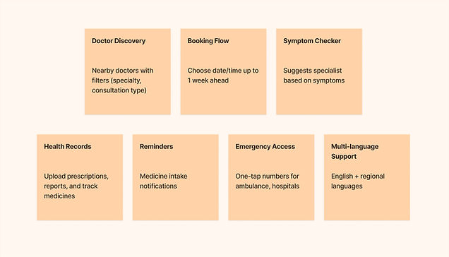
After testing my designs with friends, family, and a few people who closely fit into the target user group, I gathered valuable feedback that helped refine the app. One of the key suggestions was to add a filter for doctor specialization, making it easier for users to quickly find the right doctor. Another common request was a symptom checker to guide patients in choosing the appropriate specialist, which I integrated into the design. I also received feedback about including an option to book medical tests directly through the app. While this feature hasn’t been implemented yet, it’s in progress as part of the next design iteration. These improvements have made the app more practical, intuitive, and aligned with real user needs.


Final Design
The final designs of LocalMed focus on simplicity and trust. With added filters, a symptom checker, and organized records, users can find the right care faster and manage their health with ease. The clean, multilingual interface ensures accessibility for people in smaller Indian cities.
Choosing a Doctor


Clean list and profile views make it easy to browse doctors by specialty, apply filters, and check key details like availability, fees, and language before selecting a provider.
Booking an Appointment


A step-by-step booking flow guides users through date, time, and payment options with clear confirmations, reducing errors and wait times.
Other Pages


Supporting pages for Medicines, Documents, and Profile let users track prescriptions, upload or view health records, and manage personal information in one organized space.
My Learnings
Working on LocalMed taught me how important it is to truly understand the users’ environment and challenges before designing solutions. By listening to feedback and iterating, I realized that even small features—like a filter or a symptom checker—can make a huge difference in people’s lives. This project helped me grow as a designer by balancing empathy with practicality, and it reinforced my belief that good design should always be simple, inclusive, and purposeful.
